NatWest Rewards
NatWest offer a range of fee-paying current accounts to their customers called Reward accounts. These accounts can offer travel & mobile insurance, retailer & cinema discounts, cashback, and more.
Working with a consultant UX researcher over 3 months, we were tasked with creating a more engaging and personalised digital experience for users with access to these products.

Existing UX review
I started by gathering the existing user journeys and any data to help understand the user’s view. The experience was fragmented within the app and relied on external links to portals. For example, benefits such as travel insurance, directed the user to the “Membership Services” portal before a handoff to the insurance provider.

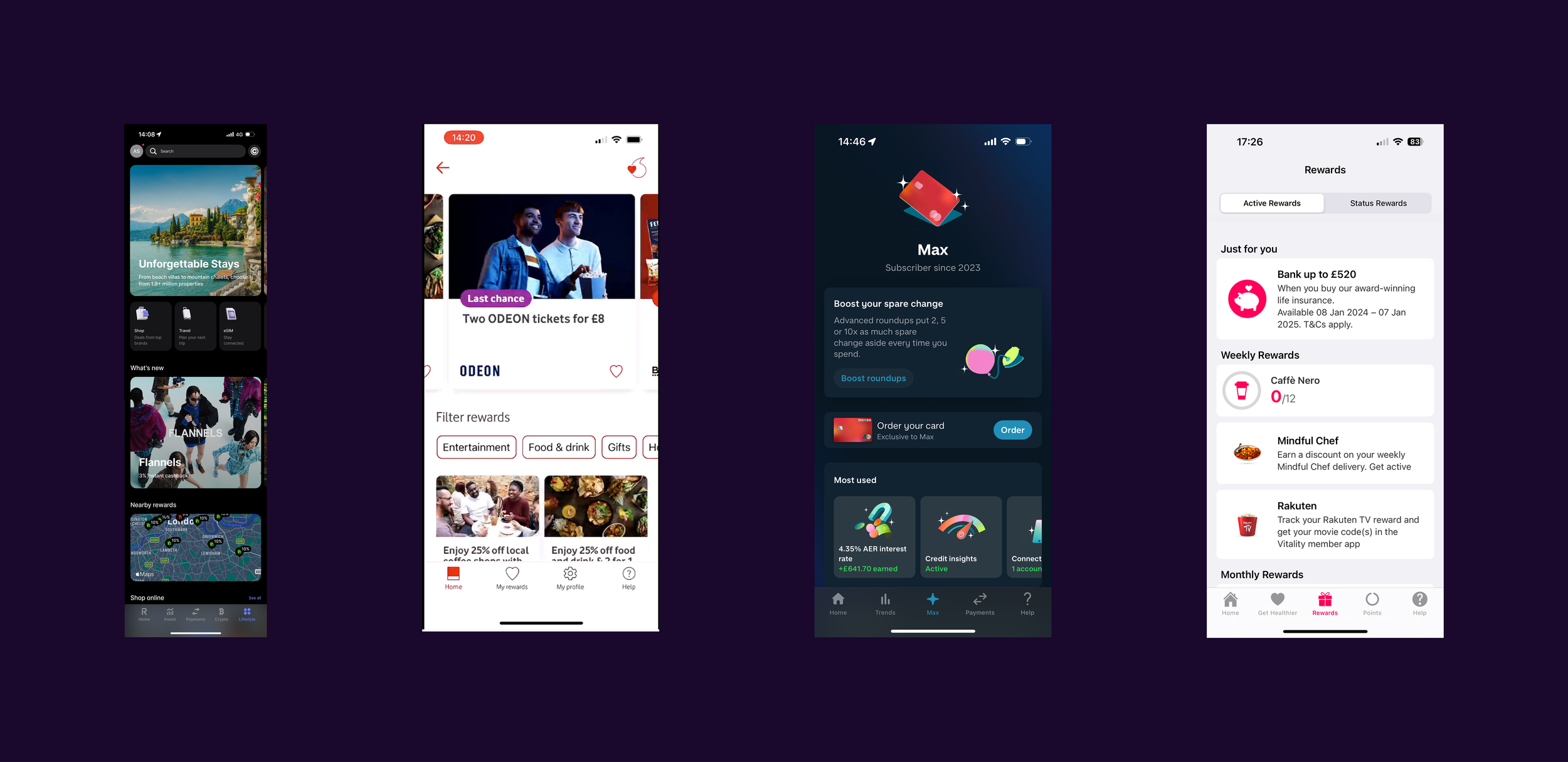
I also used this time to start competitor analysis. My main focus was the information architecture (IA), and found that most competitors had established a ‘hub’ where all benefits could be accessed via the bottom navigation bar. Examples include Monzo, Revolut and Vitality.
Ideation workshop
After identifying the problem presented to us by the business, we held an ideation workshop with all stakeholders to gather as many ideas as possible using “How Might We” statements. This ensured we were all aligned on the vision for this experience.
From synthesis we defined our key priorities for this experience as:
Creating a single place in the app for all rewards and benefits
Engage users through everyday tasks in the app
Personalise using user location and spending data

Concept testing
To address the fragmented experience, I looked at creating a hub for rewards and benefits. It was important to understand how users categorised all their benefits. We found that users preferred to see all their cash rewards separate from other benefits they paid for (e.g. mobile and travel insurance).

To drive engagement, I decided that contextual navigation should be the main route into the rewards and benefits hub. For example, we could surface relevant rewards or benefits based on users transactions. This tested well because users are mainly focused on their daily banking needs.

In personalising the experience, I looked at geotargeting rewards through push notifications and in-app maps. This was an idea I had leveraged from a previous project. This tested well in research as did the categorised rewards based on user spending data.

Usability testing
For the next stage of the project we needed to test if users could find the rewards and benefits hub, and see if the page hierarchy of the hub made sense to users. To help me visualise the prototype and come up with our research objectives I built an end-to-end user flow.

During moderated testing sessions we learnt where participants expected to view their rewards and benefits, tested to see if they could complete a series of tasks within the hub, and asked them to rate how important certain information and tasks were to them.
Testing results & final designs
The rewards hub contained personalised retailer offers and a balance of rewards earned - placed prominently as it was the most important action from testing. The background gradient is unique to this area of the app to give the space a premium feel.
When viewing all retailer rewards, the user is given the option to browse offers by category, brand, and by location - bringing in personalisation concepts that tested well earlier in the project. The detail of an offer gives the user a brief overview of what the offer entails without taking the user out of the app.

The benefits section listed all available benefits clear and simply - bringing all the detail into the app from the external portal. To drive revenue, we highlighted all unavailable benefits to allow users to explore other Reward accounts - experimenting with new styles of illustrations.

Did it work?
This project was in-house consultancy for our business partners. They are currently evaluating when to implement this change.