NatWest Offers and Experiences
NatWest current account and Mastercard credit card holders have access to Priceless offers and experiences - a selection of offers and experiences available through Mastercard.
The initial ask from our business partners was to enhance this feature with geotargeting. This would allow the user to enable their location to see what offers and experiences were nearby.
Existing UX review
After defining the success metrics and sharing the project plan with my stakeholders I performed an UX audit on the existing experience. We found that were was not much of an experience, rather an unsorted list of offers with inconsistent content formats. With little content available, the user was being asked to be leave the app to read more about the offer - likely impacting the conversion rates.
Competitor analysis
During a design huddle with my team, I took the opportunity to run an ideation workshop on this project. As a result, I had wide range of competitor experiences to leverage in the ideation phase of the project. Learning from similar experiences in apps like Amex, Revolut and Airbnb, it was clear that to offer a geotargeted view of offers, we would also need to restructure the landing screen to group related content.
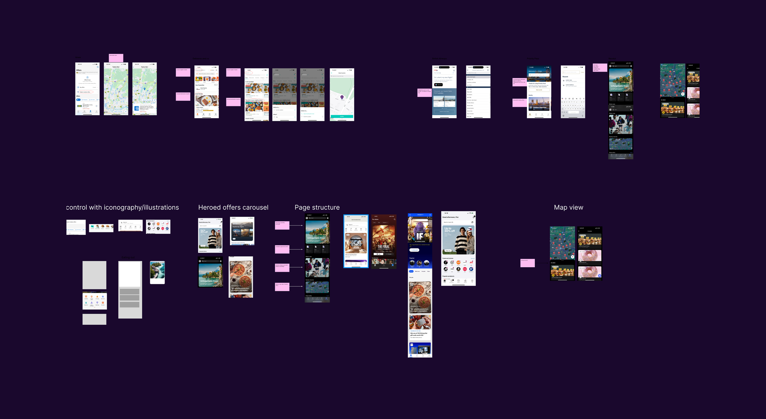
Initial concepts
Following rounds of low fidelity designs and discussions within our design community, I presented my recommended design to our business and tech stakeholders as well as external stakeholders at Mastercard who would use these designs as a basis for setting up a new API.
Complexities during build
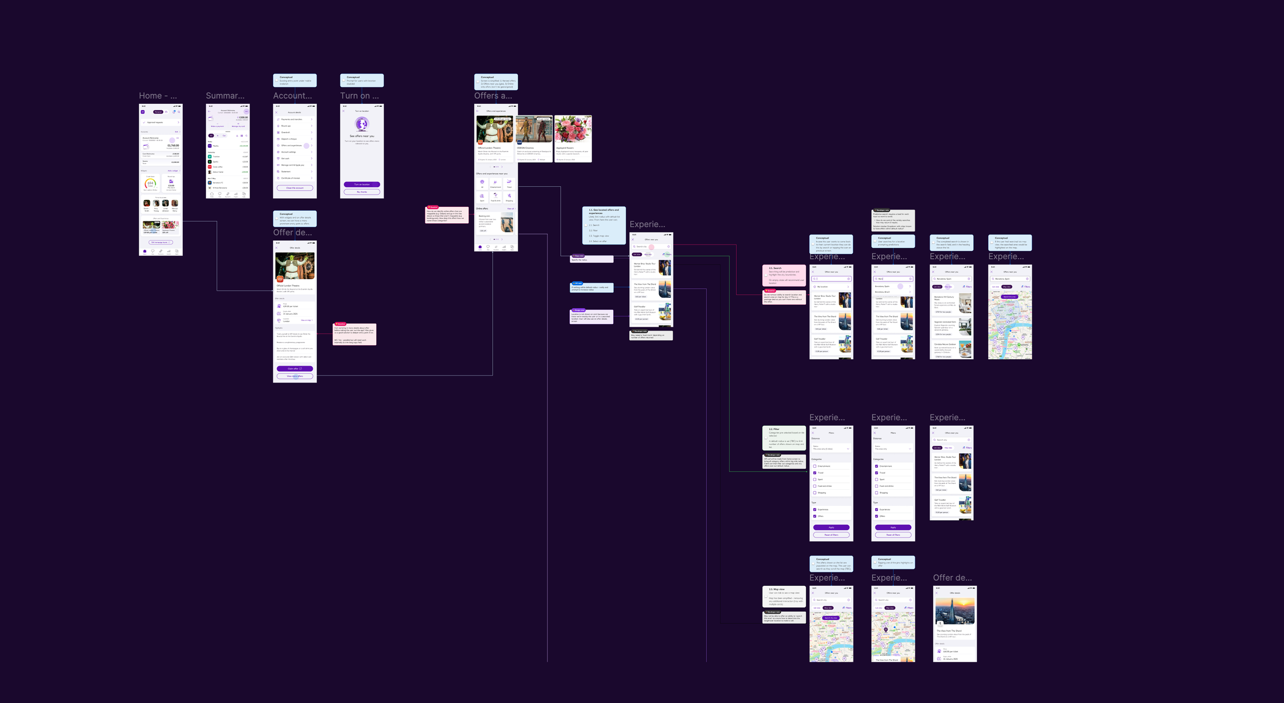
Following months of discussion between our internal tech team and external stakeholders, an updated API was finally available for us to consider in our final designs. Due to the technical complexity of building a map that showed all offers around the user, unforeseen edge cases emerged that required a rethink on the user experience and screen designs. This required quickly adapting to changing requirements and rapid ideation, however, I was able to maintain the core experience improvement even if the design itself differed from the original concepts.
Final designs
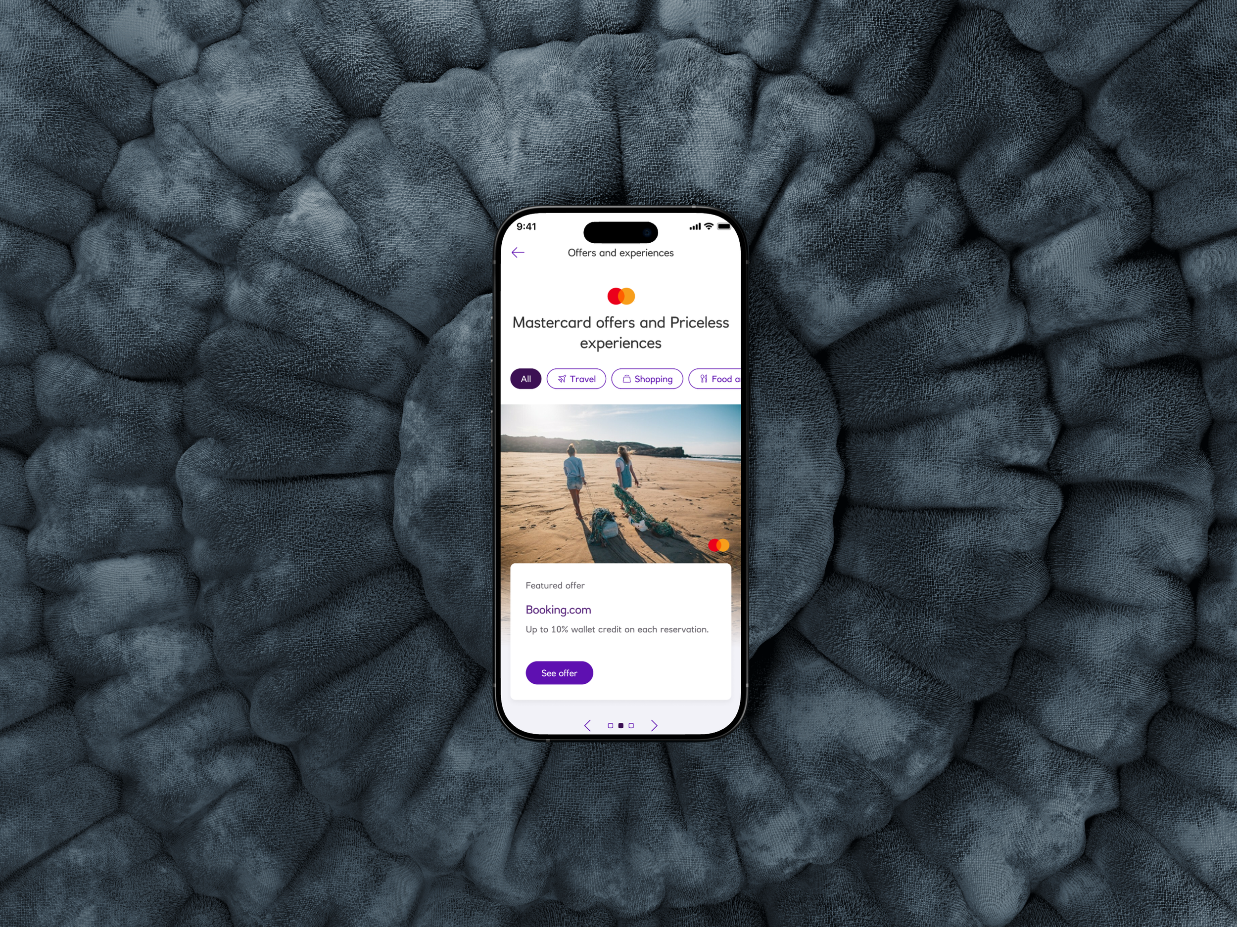
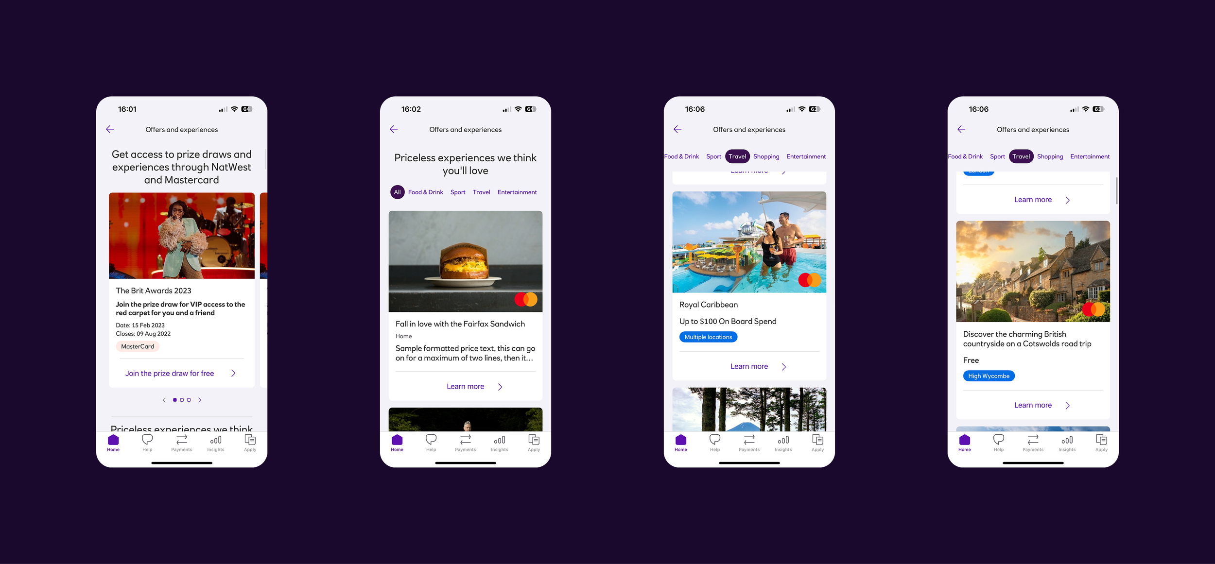
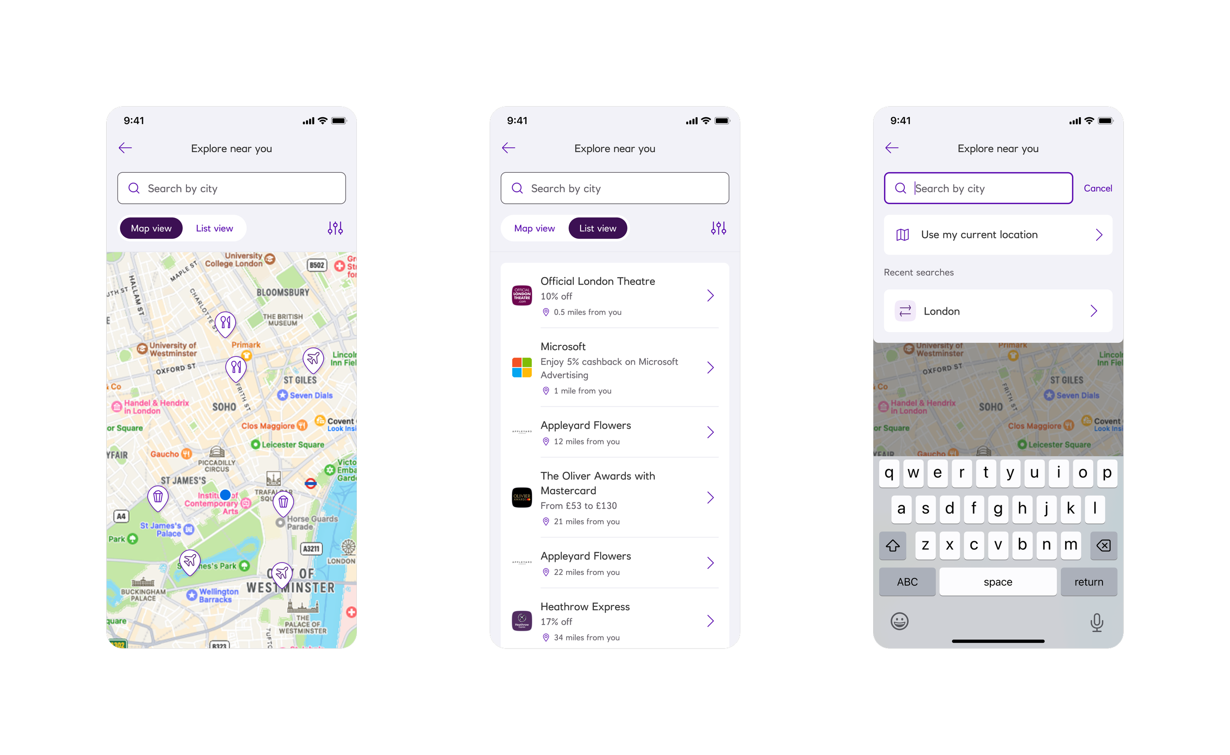
I reorganised the landing screen by grouping content: offers and experiences were grouped separately addressing the endless scroll of unsorted content. Offers sat below the featured content carousel, receiving higher priority than experiences based on usage data. Inbetween offers from the API I was able to ensure the user had more information about an offer before they made the decision to leave the app to redeem it.
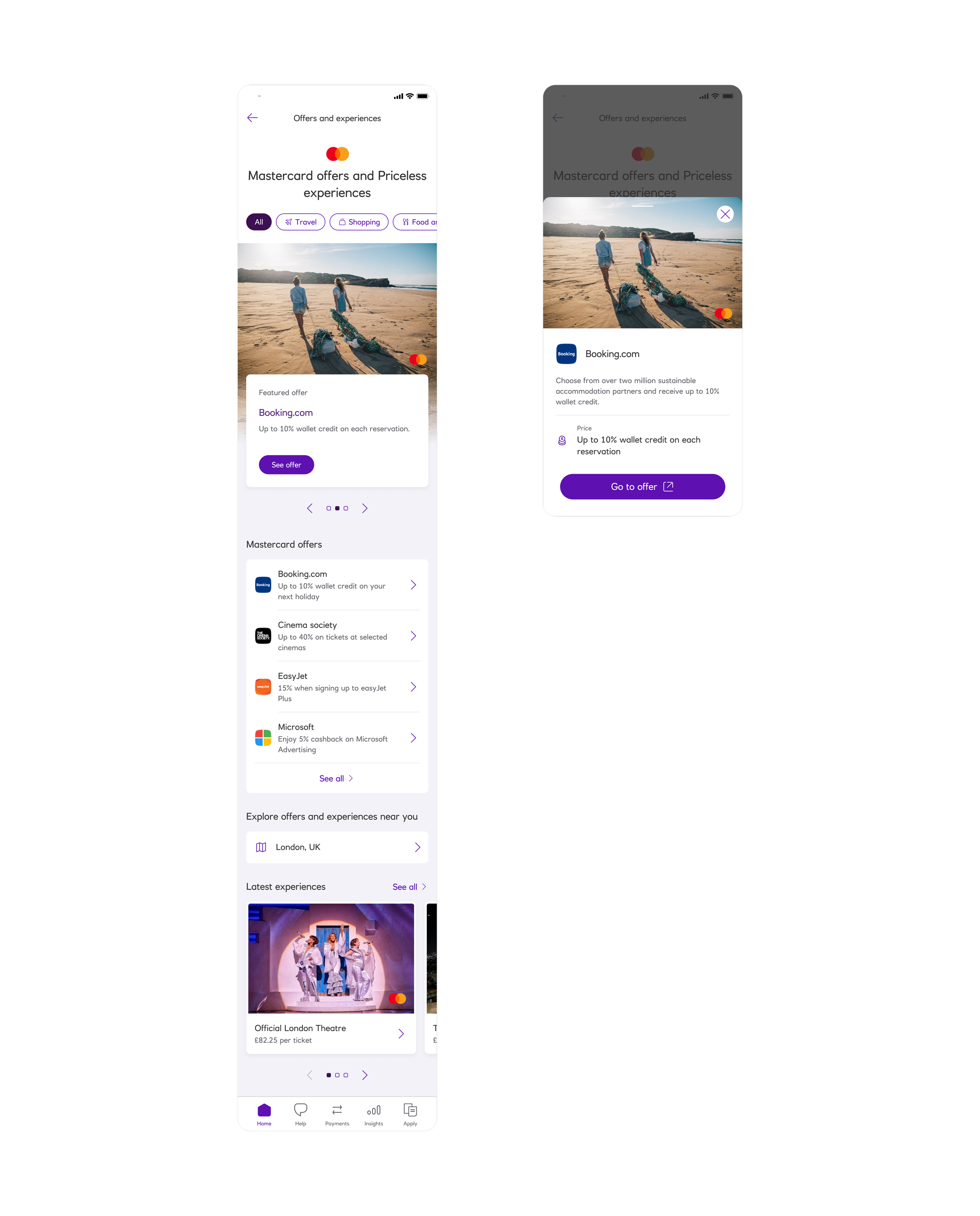
Between offers and experiences was the entry point to the new functionality of this feature: a map view of offers around the user - already showing the user’s location (if enabled). The map view, and interactions within this screen all followed similar patterns I had seen through competitors. Visually, icons were added to the map pins to help users quickly identify which category an offer or experience belonged to.
Did it work?
Following the first month of deployment we saw 3x increase in visits to the offers and experiences landing screen with half of those users exploring the new map view feature. Although we saw a decrease in users opting to follow the offer outside of the app, it was reported that Mastercard saw higher conversions through their site. This proved that by giving users more information, they were more confident in their action to leave the app.
This project was a hugely complex build for our tech teams, requiring multiple squads and releases to deploy and we received recognition for our collaboration between teams internally to deliver above and beyond an MVP.